AI Interface Design
Component-Based Design for AI: Best Practices
Learn how component-based design can streamline AI interface development, enhance scalability, and ensure consistent user experiences across applications.

Creating scalable, modular AI interfaces is simpler than you think. Component-based design breaks down complex systems into reusable pieces, making development faster and more efficient. Here's what you need to know:
Atomic Design Framework: Build interfaces using five levels - atoms (basic elements), molecules (small groups), organisms (larger structures), templates (page layouts), and pages (final implementations). This structure ensures consistency and speeds up workflows. For example, Airbnb reduced handoff time by 35% using this approach.
Design Tokens: Centralize styling properties like colors and spacing to maintain uniformity. Updates propagate system-wide, cutting style-related bugs by 40%.
Modularity: Clear interfaces and minimal dependencies make components scalable and easier to maintain. Organizations have reported cost reductions and faster implementation times by adopting this method.
AI Tools: Leverage AI to generate components from prompts or visuals, saving time on repetitive tasks. Tools like UXPin and Bit.dev streamline design-to-code processes.
Performance Optimization: Use strategies like virtual scrolling, progressive loading, and responsive layouts to handle data-intensive AI applications efficiently.
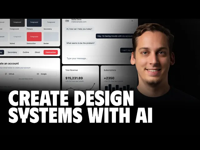
How I Create Custom AI Design Systems (That Don't Look AI-Generated)
Core Principles for AI Component Design
Building effective AI components requires striking a balance between flexibility and consistency, ensuring they can scale alongside your product. One approach that stands out is Atomic Design, a granular framework for creating scalable AI interfaces.
Atomic Design Methodology
Atomic Design organizes interfaces into five levels, starting with the smallest building blocks:
Atoms: Basic elements like buttons or input fields.
Molecules: Groups of atoms, such as search bars.
Organisms: Larger structures formed by combining molecules, like navigation headers.
Templates: Page-level layouts without actual content.
Pages: Final implementations populated with real data.
This method is especially effective for AI interfaces, where complex dashboards, control panels, and data visualizations are often required. By using standardized building blocks, teams can create these intricate interfaces efficiently.
A great example is Airbnb's use of Atomic Design in their Design Language System (DLS). They developed over 200 reusable components, which led to a 35% reduction in handoff time and a 20% improvement in design consistency. Michael Fouquet, Airbnb's Design Systems Lead, spearheaded this initiative. For AI applications, this approach allows teams to assemble interfaces rapidly while maintaining both visual and functional uniformity.
Design Tokens for Consistent Styling
In addition to structural organization, visual consistency is key. Design tokens centralize styling properties, such as colors, spacing, typography, and shadows, across your application. Instead of hardcoding values like #3B82F6 for blue or 16px for padding, tokens use semantic names like color-primary or spacing-medium.
This approach is more than just convenient - it reduces style-related bugs by up to 40%, as reported by companies adopting design tokens. Updates to tokens automatically propagate throughout the system, eliminating tedious manual changes that often introduce errors.
Design tokens are particularly useful for AI interfaces that need to adapt to various contexts. For instance, a machine learning dashboard might switch between light and dark themes, adjust for different data densities, or scale across multiple screen sizes. With a well-structured token system, these changes happen instantly across all components.
A logical token hierarchy ensures smooth updates. Here's how it works:
Base tokens define raw values (e.g.,
blue-500: #3B82F6).Semantic tokens assign meaning (e.g.,
color-primary: blue-500).Component tokens specify usage (e.g.,
button-background: color-primary).
This structure makes global updates quick and efficient - what once took hours can now be done in minutes.
Modularity and Scalability
Modularity ensures that each component operates independently while integrating seamlessly with others. Whether displaying real-time sensor data or historical analytics, a well-designed AI component should function reliably across various use cases, from complex dashboards to simple status pages.
To achieve this, components should have clearly defined interfaces and minimal dependencies. Each component needs to specify the data it requires, the events it triggers, and how it interacts with parent components. This clarity becomes critical as AI systems evolve and new features are introduced.
The benefits of modularity are tangible. Organizations have reported cost reductions from $1M to $750K, shorter implementation times (from 10 months to just 2), and fewer quality assurance issues (dropping from 10 to 5 incidents per month). Additionally, the number of reusable components per project increased from 0 to 10.
Scalability ensures that components can handle growth without breaking. This means designing for varying data loads, accommodating different user permissions, and adapting to changing business needs. For example, a data visualization component should perform well whether it’s processing 100 data points or 100,000. Similarly, user interface elements should gracefully adapt as new features are added or existing ones are updated.
USA Today’s frontend team demonstrated this with their design language system, guided by five critical questions for each component: name, composition, variants, scalability, and style variables. This approach improved clarity and maintainability across their digital products. The same systematic thinking applies to AI components, helping prevent architectural debt and ensuring smooth scaling.
Building and Managing Component Libraries
When creating modular, high-performance AI interfaces, having a well-maintained component library is crucial. A thoughtfully organized and regularly updated library can streamline development and ensure consistency across projects.
Organizing Components for Clarity
How you structure your component library directly affects how efficiently teams can locate and use the right elements. A clear, predictable organization system can make all the difference. One of the most effective methods is to use a hierarchical folder structure inspired by the atomic design methodology. Here’s an example:
This setup helps developers and designers immediately identify where specific components belong and where new ones should go. For AI projects - like machine learning dashboards or conversational interfaces - this clarity is especially valuable, as these systems often involve complex interactions.
Naming conventions also play a big role. Use concise, descriptive names like ModelStatusIndicator, DataVisualizationPanel, or ConversationBubble. These names clearly convey each component's purpose, cutting down on confusion during development.
For larger libraries, grouping components by function can be even more effective. Categories like data display, user input, navigation, or AI-specific elements (e.g., model controls, feedback mechanisms) allow teams to quickly locate the type of component they need for a given task.
Once your library is well-organized, the next step is to ensure it’s properly managed and maintained.
Maintaining Shared Libraries
Effective management keeps your library up-to-date and ensures consistent quality. Version control and a well-defined update process are key here.
Using Git workflows can help structure collaborative updates. Every change to a component should go through a review process before being merged into the main branch. This approach avoids introducing errors or breaking changes into production, maintaining a high standard across the library.
As the library grows, dependency management becomes increasingly important. Tools like Bit can help track dependencies between components, ensuring compatibility across projects. For example, if you update a core component, these tools can highlight which other components might be impacted, helping you avoid cascading issues that could disrupt multiple applications.
For testing and experimentation, Storybook is a great tool. It creates isolated environments where developers can safely experiment with components or demonstrate them to stakeholders without risking production stability.
To prevent your library from becoming bloated, schedule regular reviews - monthly, if possible. These reviews allow you to remove outdated components, consolidate duplicates, and ensure the library continues to meet your team’s evolving needs.
Component Documentation
Good documentation transforms your component library from a collection of code into a truly valuable resource. Start with metadata for each component, detailing technical information like required props, optional parameters, dependencies, and intended use cases.
Clear usage guidelines are also essential. These should include not only how to implement a component but also common mistakes to avoid. For AI components, this is especially important since they often handle complex data flows or user interactions that aren’t immediately intuitive.
Visual examples are another must-have. Screenshots, interactive demos, and code snippets can illustrate how components behave and when they’re best used. For AI interfaces, showing components in action with realistic data can help developers better understand their function and performance.
When documenting configuration options, keep it practical. For instance, a data visualization component might support various chart types, color schemes, or interaction modes. Provide examples that show how to configure these options and explain the trade-offs between them.
AI tools can simplify the documentation process. For example, UXPin’s AI Component Creator can automatically generate documentation based on component metadata, reducing the effort required to keep documentation up-to-date. This ensures that documentation stays aligned with code changes, avoiding the common problem of outdated or inaccurate instructions.
Finally, maintain detailed update logs. These logs should track technical changes, explain why updates were made, and outline any necessary migration steps for existing implementations. This transparency helps teams adapt quickly to changes without disrupting their workflows.
For teams creating complex AI applications, working with professional design studios can be a smart move. As Luke Dalton, Founder of Exalt Studio, puts it:
"Design isn't a feature, it's the foundation of a successful startup".
Specialized design systems and component services, starting at $7,499, can provide the expertise needed to develop polished, developer-ready libraries that enhance clarity and drive growth.
Using AI Tools for Component Design and Automation
AI tools are reshaping how UI components are created, cutting down development time and automating repetitive tasks that often slow down progress. This shift allows for faster component creation and more thorough testing, streamlining the development process.
AI-Powered Component Generation
Today's AI tools can generate fully functional, production-ready components from either detailed prompts or visual inputs. Take UXPin's AI Component Creator, for example. It integrates with models like OpenAI and Claude to produce both design layouts and React code at the same time. This eliminates the back-and-forth between design and development teams.
One standout feature is image-to-component conversion. By uploading a screenshot of an interface element - like a login form, pricing table, or navigation bar - the AI analyzes the visual structure, identifies interactive elements, and generates functional code. This is especially helpful for startups needing to adapt designs quickly.
In 2024, Nextrope showcased the efficiency of AI-powered tools by using UXPin's AI Component Creator to build a contact form. They cut their development time by over 50% compared to manual coding. The AI-generated code required only minor tweaks before being deployed. For startups aiming to hit the market fast, this kind of time-saving advantage can make a big difference.
Another tool, Bit.dev, offers a collaborative approach. It allows developers to create or modify components within shared workspaces. By referencing component documentation and design tokens, the AI ensures new components align seamlessly with existing design systems.
The real benefit? It’s not just about speed - it’s about maintaining consistency across your component library while reducing the manual workload.
Writing Effective Prompts for AI Tools
To get the best results from AI tools, you need to provide clear, detailed instructions. Just like well-documented component libraries, precise prompts lead to better consistency. If your input is vague, the AI will deliver generic results. But when you give specific, detailed instructions, the output is far more aligned with your needs.
For example, instead of saying, "Create a button", try something like: "Primary CTA button, blue (#007bff), white text, 12px padding, rounded corners, hover darkens to #0056b3". This level of detail ensures the AI knows exactly what you want.
Context matters too. Let the AI know where and how the component will be used. For instance, a prompt like, "Design a data visualization panel for an AI dashboard that displays model accuracy metrics, includes toggle options for time periods, and follows our existing card component styling", gives the AI a much clearer idea of your needs than just asking for a chart.
Including design tokens or style guides in your prompts helps ensure the AI-generated components align with your established patterns, saving time on edits later.
For complex components with custom interactions, break your requests into smaller parts. Instead of asking for an entire chat interface, start with individual elements like message bubbles, input fields, and status indicators. Once those are ready, you can combine them into a complete interface.
If possible, provide visual references or links to similar components. These examples help the AI better understand your design intent, especially for intricate styling or interaction patterns that might be hard to describe in words.
Testing AI-Generated Components
While AI can automate much of the development process, thorough testing remains essential to ensure the components perform as intended.
Start with isolation testing using tools like Bit's development server or Storybook. This lets you verify functionality in a controlled environment, free from the complexities of a full application. Test all interactive states and edge cases to confirm the component behaves as expected.
Accessibility checks are critical for AI-generated code. Use automated tools like axe-core or Lighthouse to ensure compliance with WCAG standards. Pay close attention to color contrast, keyboard navigation, screen reader compatibility, and focus management - areas where AI often falls short.
Cross-platform testing is another must. Preview components on various devices and browsers to catch any responsive design issues or rendering inconsistencies. AI tools don’t always account for these variations automatically.
For components that handle real-time data, write tests for props, state management, and integrations.
Establish a review process where both designers and developers evaluate the components before they’re finalized. This human oversight helps catch issues that automated testing might miss and ensures the components align with your project’s overall vision and technical standards.
Lastly, performance testing is crucial, especially for components that process large datasets or update frequently. Monitor rendering speed, memory usage, and network requests to ensure the components don’t slow down your application.
Document any changes made during testing. This creates a feedback loop, improving future AI-generated components and reducing the need for extensive manual corrections over time.
Performance Optimization for AI Components
When building AI applications, performance boils down to instant responses and efficient data handling. AI components often grapple with challenges like real-time data visualization and managing massive datasets. Optimizing these elements is crucial for delivering a smooth and user-friendly experience. These strategies align with modular design principles to keep performance at its peak.
Optimizing Rendering Performance
AI applications frequently display continuously updating data, making efficient rendering a top priority. Here’s how to tackle this:
Use smart update strategies: Tools like React's
memoanduseMemohooks can help avoid unnecessary re-renders, especially for components that update frequently.Incorporate virtual scrolling: For large datasets, only render visible items and a small buffer around them. This approach significantly reduces load times when working with thousands of data points.
Utilize skeleton screens and progressive loading: Instead of showing blank spaces while data loads, use placeholder content that mimics the final layout. This keeps users engaged while processing happens in the background.
Optimize component bundling: Break down heavy or AI-intensive components into smaller bundles. Load features like complex charting tools or visualization modules only when needed.
Adopt an atomic structure: Designing components with minimal dependencies helps reduce re-rendering overhead.
Cross-Platform Consistency
AI applications need to function seamlessly across web browsers, mobile devices, and desktops. Achieving this requires thoughtful planning:
Account for device capabilities: Mobile devices often have less processing power than desktops. Adjust functionality based on the device - for example, simplify real-time visualizations on mobile while maintaining full interactivity on desktops.
Implement responsive data loading: On slower networks or less powerful devices, prioritize loading critical insights first, then gradually add more details. This staged approach ensures a better experience under varying conditions.
Use flexible layout systems: CSS Grid and Flexbox are invaluable for creating layouts that adapt to different screen sizes and orientations, especially for dynamic, data-heavy interfaces.
Standardize interaction patterns: A unified design system ensures consistency in appearance and behavior across platforms, making it easier for users to understand complex data regardless of their device.
Test across diverse devices: Automate testing to meet performance benchmarks like a First Contentful Paint under 1.8 seconds and Time to Interactive under 3.5 seconds.
Accessibility and Responsiveness
Beyond speed and performance, ensuring accessibility and responsiveness is critical. AI interfaces often handle complex data, so accessibility must be integrated from the start:
Implement proper ARIA roles and labels: Make sure dynamic content is navigable using only a keyboard or assistive technologies. Full keyboard navigation is a must for interacting with data visualizations and AI-generated results.
Provide clear status indicators: Replace generic loading spinners with meaningful updates like "AI is analyzing your data… 60% complete." This gives users better context.
Plan for varying network conditions: Offer graceful fallbacks for slow or unstable connections, such as showing cached results or offline messages when needed.
Conduct thorough accessibility testing: Combine automated tools with real-world testing using assistive technologies like NVDA or JAWS to ensure an inclusive experience for all users.
Reduce cognitive load: Break complex outputs into smaller, more manageable pieces through progressive disclosure. This makes the interface easier to navigate and understand.
A modular architecture, central to component-based design, supports these accessibility practices by ensuring that each component operates independently with clear interfaces. This approach minimizes the risk of introducing issues during updates or improvements.
Building Scalable and Maintainable AI Design Systems
Creating scalable AI design systems relies on principles like atomic design and consistent use of design tokens. These systems not only speed up development but also improve maintainability. By adopting a component-based approach, businesses have reported efficiency gains of 30-50% and task completion improvements of 39%.
The foundation of successful AI design systems lies in atomic design principles. This method breaks interfaces down into five levels: atoms, molecules, organisms, templates, and pages. Such structured scalability has measurable benefits - Airbnb's design system, for example, reduced design-to-development time by 35% and increased consistency by 20%.
To build on this structure, design tokens play a critical role in maintaining visual consistency. These tokens replace hardcoded values with dynamic references like color.primary.500, which can cut style-related bugs by up to 40%. Tools like Figma and Storybook simplify the implementation of these tokens across various platforms and components.
A modular architecture further enhances scalability by allowing independent yet cohesive AI components. This setup simplifies how AI tools interpret source code and manage dependencies within specific components . The focus should be on creating self-contained modules with clear interfaces, making updates easier and more efficient across the entire system.
Automation also plays a vital role in modern design systems. AI tools can now generate both designs and React code simultaneously, significantly reducing the time needed for development. The effectiveness of these tools often depends on crafting precise prompts - detailing specifics like colors, padding, hover states, and functionality instead of relying on vague descriptions.
The component-based approach ensures scalability as your product grows. Luke Dalton, Founder of Exalt Studio, emphasizes the importance of design in product success:
"Design isn't a feature, it's the foundation of a successful startup. Most founders don't fail at building software. They fail at making it clear, usable, and adoption-ready fast enough to grow."
To keep AI design systems maintainable, consistent attention to documentation and version control is essential. Comprehensive documentation should include examples, configuration details, and centralized repositories. Regular updates, informed by user feedback and evolving design trends, ensure the system stays relevant. This structured approach supports faster iteration, better quality, and enhanced user experiences, especially in handling complex data interactions .
FAQs
What are the advantages of using the Atomic Design Framework for developing AI interfaces compared to traditional design methods?
The Atomic Design Framework provides a clear and organized way to create AI interfaces by dividing designs into smaller, reusable components such as atoms, molecules, and organisms. This modular approach makes it easier to adapt and expand interfaces as AI systems grow and change.
Unlike traditional design methods, this framework helps maintain consistency across the user interface while streamlining the development process. By reusing components across various projects, teams can cut down on repetitive work and ensure a seamless user experience. This is especially important in AI applications, where clarity and ease of use are key to managing intricate interactions.
What are design tokens, and how do they help create consistent and efficient AI applications?
Design tokens are the reusable, universal elements that define attributes like colors, typography, spacing, and more. Think of them as the DNA of a design system, ensuring consistency in both the look and functionality of an application.
Incorporating design tokens into AI applications simplifies updates, keeps user interfaces consistent, and speeds up development. This method not only saves time but also makes adapting designs simpler as the application grows and changes.
Can AI tools fully replace manual design and coding for components, or do they still need human input?
AI tools have come a long way in automating tasks like component design and coding. They’re great for handling repetitive work and even suggesting ways to improve efficiency. However, they can’t fully substitute the creativity and judgment that humans bring to the table. Crafting designs that are intuitive and truly user-focused still requires a human touch.
Beyond that, developers and designers are key to fine-tuning what AI produces. They ensure the results align with the project’s specific goals and reflect the brand’s identity. When you combine the strengths of AI with human expertise, the results are often more inventive and effective.