Blockchain UX
Best Practices for Liquidity Pool Data Visualization
Guidelines for visualizing liquidity pool metrics—TVL, volume, liquidity depth, chart selection, interactivity, and accessibility for clear DeFi dashboards.

Clear liquidity pool data visualization is essential for understanding decentralized finance (DeFi) metrics and making informed decisions. Liquidity pools power decentralized trading, and visualizing their data effectively can help users identify risks, improve returns, and assess performance.
Key insights include:
Important metrics: Total Value Locked (TVL), trading volume, liquidity depth, and impermanent loss.
Effective chart types: Line charts for trends, bar charts for comparisons, pie charts for asset distribution, and depth charts for price impact.
Interactive features: Tooltips, time frame controls, and filters enhance usability.
Avoid common mistakes: Start Y-axes at zero, avoid clutter, and use accessible color schemes.
Visualizing liquidity pool data correctly can simplify complex information, helping users quickly analyze trends, risks, and opportunities. Use clean layouts, concise labels, and well-chosen chart types to make dashboards user-friendly and actionable.
Core Components of Liquidity Pool Dashboards
Pool Information Display
A dashboard's primary job is to make liquidity pools easy to identify. Pair symbols like "ETH / stETH" alongside their logos help users recognize pools instantly. This approach aligns with Jakob's Law, which suggests that users prefer familiar interfaces that work like those they've already encountered.
For added transparency, contract addresses should be shown in a shortened format (e.g., "0xdc24…7022") and linked to block explorers like Etherscan. This allows users to verify pool details directly on-chain. In cases where protocols use Uniswap v4's singleton architecture, dashboards should replace unique contract addresses with Pool IDs, as all pools are managed under a single PoolManager contract.
Fee tiers are another critical detail. These tiers - commonly 0.01%, 0.05%, 0.3%, and 1% - directly impact user returns. Some newer protocols may adopt dynamic fees, adjusted with "hooks" rather than fixed percentages. Additionally, it’s essential to label the blockchain or network (e.g., Ethereum, Arbitrum, or Polygon), especially for protocols operating across multiple chains.
By focusing on these elements, dashboards lay the groundwork for presenting essential financial metrics effectively.
Core Metrics Display
Once pool details are clear, dashboards should focus on displaying key financial metrics. Highlight important figures like TVL (Total Value Locked), trading volume, and APY (Annual Percentage Yield). Use concise USD formatting with abbreviations (e.g., $1,694.0M) to improve readability. A TVL exceeding $100 million often signals lower risk.
The Volume/TVL ratio is another insightful metric. A ratio above 0.5 indicates strong capital efficiency, meaning over 50% of the pool's TVL is actively traded. Conversely, a ratio below 0.1 suggests much of the capital isn’t generating meaningful returns.
It’s also crucial to differentiate APR (Annual Percentage Rate) from APY. For instance, a 50% APR compounded daily results in a 64.8% APY. Breaking down yield sources - such as trading fees versus reward incentives - adds transparency. Dashboards should also display price impact next to estimated output amounts, with an ideal target of less than 0.1% for pools with deep liquidity.
"No matter how beautiful, no matter how cool your interface, it would be better if there were less of it." – Alan Cooper
For more complex pools, like those on Curve, expandable table rows can be a game-changer. Users can click to reveal detailed token balances and individual values, keeping the layout clean while still offering in-depth information on demand.
These foundational components pave the way for implementing effective visualization techniques in subsequent sections.
Uniswap v3 on-chain analytics risk dashboard with Dune
Best Practices for Visualizing Liquidity Pool Data
Liquidity Pool Data Visualization Chart Types and Metrics Guide
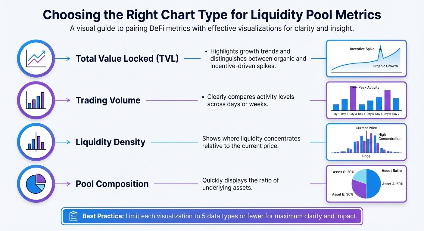
Selecting the Right Chart Types
Picking the right chart type is essential for presenting liquidity pool data effectively. For tracking trends over time, line and area charts are great options. They work well for metrics like Total Value Locked (TVL), token prices, or historical APY trends because they highlight both direction and magnitude of change. Area charts, in particular, emphasize shifts by shading the area beneath the line.
When comparing discrete values like daily trading volumes or fees, bar charts are the go-to choice. They make it easy to recognize patterns over specific time intervals. For concentrated liquidity pools, such as those on Uniswap V3, liquidity density charts are invaluable. These charts illustrate where liquidity clusters across price ticks, offering insights into where capital is most active.
Depth charts are useful for visualizing buy and sell pressure at various price levels. They help users anticipate slippage and price impact. Meanwhile, pie charts are ideal for showing token distribution in multi-asset pools, but only if there are five or fewer slices. This keeps the visualization clean and easy to interpret.
Metric | Chart Type | Why It Works |
|---|---|---|
Total Value Locked (TVL) | Line or Area Chart | Highlights growth trends and distinguishes between organic and incentive-driven spikes |
Trading Volume | Bar Chart | Clearly compares activity levels across days or weeks |
Liquidity Density | Bar Chart (by Tick) | Shows where liquidity concentrates relative to the current price |
Pool Composition | Pie Chart | Quickly displays the ratio of underlying assets |
To ensure clarity, limit each visualization to five data types or fewer. This keeps dashboards readable and prevents overwhelming users. Also, keep chart titles concise - ideally fitting on one line (around 95 characters) for better desktop usability.
Adding Interactive Features
Interactive features transform static charts into tools for deeper exploration. For instance, tooltips are a simple yet powerful addition. They allow users to hover over a chart element and view precise numerical values that might otherwise be unclear. On Uniswap V3, for example, hovering over a liquidity density bar reveals the total locked liquidity at that price tick, along with the maximum token output during a swap.
Time frame controls are another essential feature. By offering predefined ranges like 24 hours, 7 days, or 30 days - or even custom date pickers - users can easily switch between short-term and long-term views. Curve Finance does this effectively by separating "Swaps" and "Liquidity" into distinct tabs in their Pool Activity section. Each swap entry even links to Etherscan for transaction verification, providing additional transparency.
Filters are also crucial for narrowing data. They allow users to focus on specific time frames, price ranges, or transaction types without losing sight of the overall picture. To make dashboards user-friendly, follow the 5-second rule: place critical information at the top and ensure users can find key insights within five seconds. Granular details should be accessible via interactive elements, not crammed into the main view.
"If the user can't get a hold of all the key information they are looking for in 5 seconds then the dashboard design needs some serious meddling." – Prem Parmar, Code Theorem
By combining these interactive tools with a clean layout, you can create dashboards that are both functional and visually appealing.
Common Visualization Mistakes to Avoid
Even with the right charts and features, certain missteps can undermine a dashboard's effectiveness. For example, always start the Y-axis at zero for bar, column, and area charts. This ensures the chart's scale accurately reflects the data. However, for line charts, it's acceptable to truncate the Y-axis to emphasize small but important fluctuations.
Avoid overcrowding charts with too much data. If you need to display more than five data series, consider breaking the information into multiple smaller charts or using tooltips to reveal secondary data only when needed. Overloading charts makes them hard to read and interpret.
Stay away from visual effects like 3D designs, shadows, or thick outlines, which can distort the data. When it comes to color, avoid combinations like red and green that are difficult for color-blind users to differentiate. Limit visualizations to six or fewer color divisions to keep them easy to process. Additionally, avoid 90° text rotations; instead, use horizontal bars for long labels to improve readability.
Advanced Visualization Techniques for Liquidity Pool Analytics
Using Heatmaps for Liquidity and Returns
Heatmaps are a fantastic way to simplify massive datasets into easy-to-read, color-coded visuals. Typically, the vertical axis represents price levels, while the horizontal axis shows time intervals (like minutes, hours, or days). Colors do the heavy lifting - lighter shades indicate higher trading activity, and darker ones show lower activity.
These visualizations are particularly helpful for spotting liquidity walls, which are clusters of orders that act as support or resistance zones. Instead of just relying on historical price trends, heatmaps reveal where large amounts of capital are concentrated. For instance, developer Banteg used Datashader to analyze 18.3 million DAI transfers on Ethereum. Covering 1,410 days (2019–2023) with 1-day intervals on the x-axis and a logarithmic scale on the y-axis, the visualization captured a wide range of transaction sizes.
"A liquidity heatmap is essentially a charting tool that converts market order data into an intuitive color display... like a map marking the river's flow intensity." – CoinGlass
For Uniswap V3, you can calculate active liquidity within tick ranges using the liquidityNet from initialized ticks. Advanced heatmaps often come with filters, like "Low" sliders to remove minor blocks or "Peak" sliders to emphasize major liquidity clusters.
When dealing with datasets containing millions - or even billions - of data points, traditional charting tools often fall short. As Banteg pointed out, "You can't really use your regular charting methods when dealing with millions of points". This is where specialized libraries, like Datashader, shine. They prevent overplotting and allow efficient rendering, even on standard hardware. Techniques like histogram equalization (e.g., using equalize_hist from scikit-image) help normalize colormaps, improving contrast in dense datasets.
Using heatmaps as a foundation, you can explore deeper analyses, such as comparing performance metrics or running simulations.
Comparing Performance and Running Simulations
Once you've visualized raw liquidity data, the next step is comparing performance metrics to simulate trading outcomes. For example, modeling impermanent loss versus simply holding tokens can clarify the returns from liquidity provision. In constant product AMMs, price impact can be calculated using the formula:
Price Impact = 1 – (x / (x + Δx)),
where x is the pool reserve and Δx is the trade size. To get a full picture of trading costs, combine slippage, protocol fees, and gas costs across various platforms.
Line charts work well for tracking cumulative returns over time. You can plot separate lines for HODL and LP strategies, and use shaded areas to highlight periods where one approach outperforms the other. For massive datasets, techniques like data aggregation (binning), sampling, or hierarchical clustering help keep charts readable without overwhelming the viewer.
Visualization Libraries Comparison
Choosing the right library for these advanced techniques depends on your specific needs - whether it's interactivity, handling large datasets, or deployment requirements. Here's how some popular libraries stack up:
Library | Interactivity | Rendering Speed | Best Fit for DeFi Data |
|---|---|---|---|
High (hover, zoom, click, filter) | High (WebGL support) | Interactive price/liquidity charts and cross-filtering dashboards | |
High (automated linking) | Very High (with Datashader) | Large datasets like historical tick-by-tick liquidity changes | |
Low (primarily static) | Moderate (static images) | Research papers or static reports; less suited for real-time dashboards | |
Moderate (web-native) | High (React-optimized) | Standard web-based DEX analytics like Uniswap |
For dashboards requiring smooth interactivity, GPU-accelerated WebGL libraries are a great choice. In React-based applications, Recharts integrates well, but you’ll need to handle precision conversion for values that exceed JavaScript's number limits.
Conclusion and Key Takeaways
Summary of Best Practices
A strong visual hierarchy is essential for dashboards - place critical metrics like total liquidity, 24-hour volume, and current price in the top-left corner. This aligns with the "overview first, zoom and filter, then details-on-demand" framework, which ensures users can quickly grasp the most important information at a glance. Consistency is key: use uniform color coding and interactive elements like tooltips, accordions, and contextual buttons to prevent confusion and enable dynamic filtering.
Fast-loading dashboards that deliver concise insights are non-negotiable. Keep the number of views limited to three or four to maintain clarity and avoid overwhelming users. Always include fiat equivalents, as most users think in terms of familiar currencies like USD.
By adhering to these principles, you can fine-tune your dashboard to better serve its purpose and your audience.
Next Steps for Implementation
To take your dashboard to the next level, start by auditing its layout. Ensure that the most critical data is displayed in the top-left corner and that your color schemes are both consistent and accessible. Test all interactive features thoroughly to confirm they respond quickly - slow-loading dashboards can frustrate users and cause them to lose focus.
For Web3 teams, simplifying complex liquidity data into user-friendly interfaces is a challenge that requires expertise. Exalt Studio (https://exalt-studio.com) specializes in UI/UX design for decentralized finance platforms. They offer continuous design retainers and product transformation services tailored specifically for Web3 startups. With their help, you can integrate these visualization strategies while ensuring your dashboard remains clear, responsive, and effective - helping users make informed trading decisions with confidence.
FAQs
What key metrics should I focus on when visualizing liquidity pool data?
When examining liquidity pool data, prioritize metrics like Total Value Locked (TVL), liquidity depth, active liquidity within specific price ranges, and trading volume. These figures give a comprehensive view of the pool's size, how liquidity is distributed, and the intensity of trading activity.
Focusing on these critical data points allows for visualizations that offer clarity and practical insights, enabling users to make well-informed decisions about managing liquidity and developing trading strategies.
How do interactive features improve the usability of liquidity pool dashboards?
Interactive features bring a fresh level of ease to liquidity pool dashboards by breaking down complex data and making exploration more intuitive. For instance, interactive charts let users dive into metrics like pool liquidity, APY, and TVL in real-time. Whether it’s zooming into specific timeframes, filtering data, or highlighting trends, these tools help users uncover insights without the overwhelm of static displays.
On top of that, micro-interactions - such as animations or real-time feedback when tweaking filters - add an extra layer of clarity and engagement. These small design touches guide users naturally, helping them make quicker and more confident decisions. By turning dashboards into dynamic, hands-on tools, users can navigate and analyze liquidity data with greater efficiency and ease.
What are common mistakes to avoid when visualizing liquidity pool data?
When designing liquidity pool visualizations, clarity is everything. A common misstep is selecting the wrong type of chart. For instance, pie charts with too many segments can quickly become cluttered, making it hard for viewers to extract meaningful information. Similarly, cramming excessive data into a single graphic can overwhelm the audience and bury the most important takeaways.
Another frequent issue is poor use of color. Overly busy or inconsistent color schemes can confuse your audience and distort your message. Instead, stick to simple, consistent colors that enhance readability and highlight key points.
The goal? Keep it simple, accurate, and easy to understand. By avoiding these mistakes, you’ll not only make your visuals more effective but also build trust with your audience by delivering insights they can rely on.